Hologramming Effect
November 25, 2021 Leave a comment
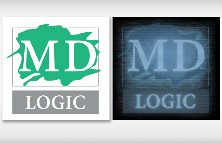
This demo takes imagery to a new level with good planning and a few Photoshop effects.
There’s a wide array of effects in Photoshop. When used in specific combinations they allow Designers and Post-production Artists to achieve extraordinary results.
This demo will go through the steps to allow you to create the Star Wars “hologram” effect with any image. In this example, we will be using a logo for a job that I’ve recently finished.
I. Breaking Out The Logo
To get the maximum value out of this effect we need to separate out the individual parts of the image. That means the text, the art and even a background for the image need to be put on separate layers.
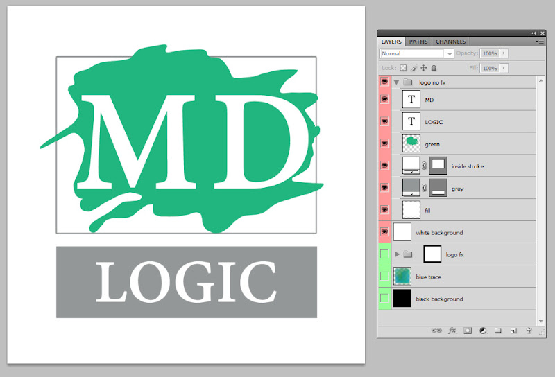
Figure A.The image is dissected in the Layers Panel. This is how the artwork needs to separated.
On this job, I interpreted each portion of the font as Adobe Devanagari but you can use Adobe Caslon or any bold, serif font such as Georgia. Here’s how to do this step-by-step
2. Open up your logo artwork and drop it into this new document.
3. Do you have an EPS or a PSD with art already separated? Good! Go to 4c and then skip to 4k for rest of these steps. If you do not have a separated image please continue to Step 4.
4. Assuming you are working with a flat file:
a. Identify and replace text.
b. Create a white box vector box w/a dark gray Stroke of 5px at #939798.
c. Set this box to “Multiply” in the Layer Panel and call it “inside stroke”.
d. Create a gray vector box under the word “LOGIC” and name it “gray”.
e. Create a new path in the Path Panel. Trace the green shape with the Pen Tool until you have a copy of this shape.
f. Select the Path then the “Load Path” icon. Make a new layer called “green”. Fill this layer with the same green from the image then turn off it’s visibility.
g. Align all of these new elements with the ones in the flat image.
h. Using the Marquee tool select the large white area around the artwork and then fill it with pure white with the paint bucket.
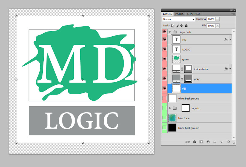
Figure B. For part “h”, turn off any background so that you can accurately create a white bitmap box around this graphic. Do not use a vector box.
For this step, the art here cannot be a vector. Later, you will see the reason.
j. The “white background” layer you see in Figures A and B was the basic “Background” layer. Paint this layer entirely white and then name it “white background”.
k. Make a new group for everything by Shift selecting all the new elements but “white background” and pressing Control+G or clicking the folder icon in the Layers Panel and dragging each one into it. Name this folder “logo no fx”.
l. We need to mask out everything within the hologram/group. Select the “fill” layer with a Control (Apple) click on the “fill” thumbnail in the Layers Panel.
m. With this layer in active selection look for the Mask Panel. If you don’t see it try Window > Masks. Look for two small icons in the upper right hand part of the Panel. These are the new mask options. Choose the one on the left to “Add New Pixel Mask”.
n. In the Layers Panel, click on the mask and drag it from “fill” to the folder for the entire artwork. This changes the mask to encapsulate everything in this folder.
o. Ensure your layers are named and stacked in the order shown in Figure A.
Now, you should have everything broke out.
With each of the elements separated we can begin to control the amount of opacity of each element. This means we can create a sense of depth in a flat image. That which is brightest will appear closest to view. Also, we can use stacking order to arrange effects to appear more prominent on certain layers.
This is the concept: We “push” or “pull” elements into or out of a background of static, scan lines and darkness. We are essentially replicating a technological function. That is very important to remember.
To create order in a design, you can make a visual hierarchy with size (large to gradually smaller), position (upper, middle and lower) or by through manipulating the opacity and levels of interference over elements.
II. Roughing In The Effect
The better part of this effect comes from layers of interference. These layers are essential. Here we need two types of interference layers: scan lines, which cover the entire image in differing degrees, and good old-fashioned static.
Right! Let’s get into some advanced type of stuff now.
a. Right click the group and select “Duplicate Group” or find the option in the options pane.
2. Name this new group “logo fx”. Place it under the first group and “white background” layer.
3. Turn off the visibility for the “logo no fx” group.
4. Create a layer on the very bottom of all of the groups called “black background” and fill it with black.
Now, we have two groups. Group “logo fx” is the one we will develop and “logo no fx” is essentially just a back-up file with unaltered elements – just in case stuff suddenly goes batstuff on us.
Make a layer called “black background” and fill it with black. We need this layer to amplify the glowing hologram effect. Set it on the very bottom of the layer stacking order.
Time to make the first of our layer of interference.
To make scan lines we need to use this file. Download it and open it up in Photoshop.
With the scanlines08.jpg file open select Edit > Define pattern. This brings up a dialog box for you to name this new pattern. Call this one Scan Lines and click OK. Now, we have added a new pattern we can use anywhere in Photoshop. Hold tight with this new style for a second.
We also need to implement this whole image in a broader way beside just one new pattern. Duplicate the image by using the Layers option and select your hologram logo file as the destination for the new layer. Here are the next steps.
2. Erase, in a general way, around the edges of the scan lines. Change it from a proper box to more of an irregular blob. We do not want sharp edges bordering this hologram.
3. Duplicate “scan lines all” within this document and call it “scan lines edges”.
4. Hide “scan lines all”.
5. Set the eraser to the Airbrush option with between 60-90% opacity. Erase from the center of “scan line edges”. Look at Figure C. to see what area you need to focus removing from this layer.
6. Turn back on “scan lines all”.
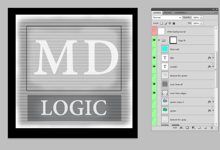
Figure C. Make scan lines over the artwork by erasing some portions of each Multiply layer. Erase from the middle for the layer “scan lines edges”.
Since these lines are on Multiply layers, Photoshop uses just the dark lines from “scanlines08.jpg” to change anything underneath this layer to a darker tone. Notice how we’ve shaped the brightness in the center of the image where the text is located?
Next, we need to use our newly made Scan Lines pattern to enhance our text.
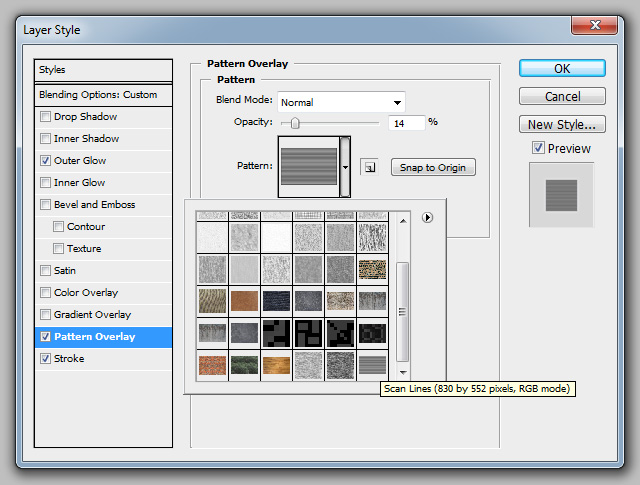
Figure D.. In the Layer Style options, we need to select Pattern Overlay then the new Scan Lines pattern.
To apply the Scan Lines pattern and effect to the text:
2. Click Pattern Overlay. Look for the pattern selection. The last one should be Scan Lines.
3. Select Scan Lines thumbnail from this dialog box.
4. Set the scale to 184% and transparency to 14%.
5. Add a dark blue Stroke of #332f5f at 1px. Set the options to Outside, 8% opacity.
6. Click Outer Glow. This is what will make the text seem more ghostly.
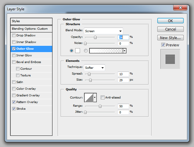
Figure E. In the Layer Style options, we need to select Outer Glow then make some adjustments.
8. Change the opacity to 34% with 0 Noise.
9. Under Elements make sure your setting is “Softer” with a Spread of 13(px) and a Size of 29(px).
10. Under Quality leave them at default which should be a sharp ramp, Range of 50 and a Jitter of 0.
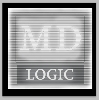
Figure F. At this stage, this is how your image should be looking.
At this point, you should be seeing the image above. To re-use this style on the remaining text, right-click on the MD font layer. In these options select “Copy Style”. Next, right-click the “LOGIC” font layer. Under these contextual options select “Paste Style”. You will want to adjust the scale of the Scan Lines and the glow to compensate for the smaller text size.
Are you worried about the time spent on this effect, yet? Hah! Well, we are over halfway done. Plus, once you have it done once you can endless copy it to other files. So, don’t worry so much. The next part is really short.
To create a well-crafted image visual complexity is very important. Layers in an image are a means to add light, shadow and area-of-effect (AOE) details that make big differences over flat ones.
III. Static
Next, we need to make some static. To make this type of interference we don’t need any more imagery. Can just use Filters.
2. Change your background color to pure white at #FFFFFF.
3. Select the mask for “logo no fx folder” by Ctrl+Shift clicking on the icon in the Layers Panel.
4. Make new layer called “static”.
5. Dump dark gray into this layer. This fill everything in that area.
6. Select Filters > Render > Fibers.
7. Move this layer behind the fonts and scan lines layers and change it to 50% opacity.
Eureka! We have static – but it needs some adjusting.
The Fibers Filter makes vertical fibers by default. Rotate your “static” layer to a horizontal position across the canvas. Slightly scale the static to cover the entire artwork. Just like the scan lines, we need to erase the sharp edges off of this layer. Erase the edges into a blobby shape.
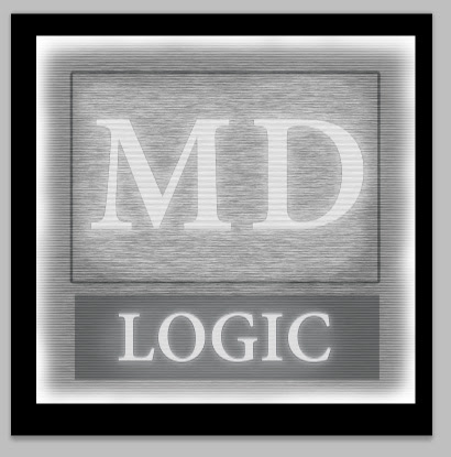
Figure G. The static layer of interference needs to have soft, faded out edges.
After your own image matches Figure G., we need to go ahead and set it to Screen and forget about it for now.
Next, use the eraser to fade out the edges of the “fill” layer. Since it’s not a vector we can erase it easily.
As you erase, think in terms of where the image would be most bright and most concentrated in this hologram. After you’ve got the edges out turn the opacity down to 50%.
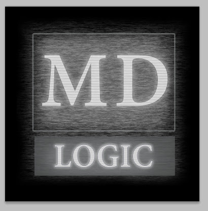
Figure H. Now, we are getting it all together in a serious way.
Figure H. is where we are at now. The effects are all in there. As black and white elements, we can see how well they work together without worrying over color. This is a great way to do business because it simplifies the process.
I told you this part was short didn’t I?
For night-vision effects using these same techniques: instead of using blue, you can use green and dial down the opacity of the scanlines. Check it out when you’re finished with the hologram.
IV. Color Casting
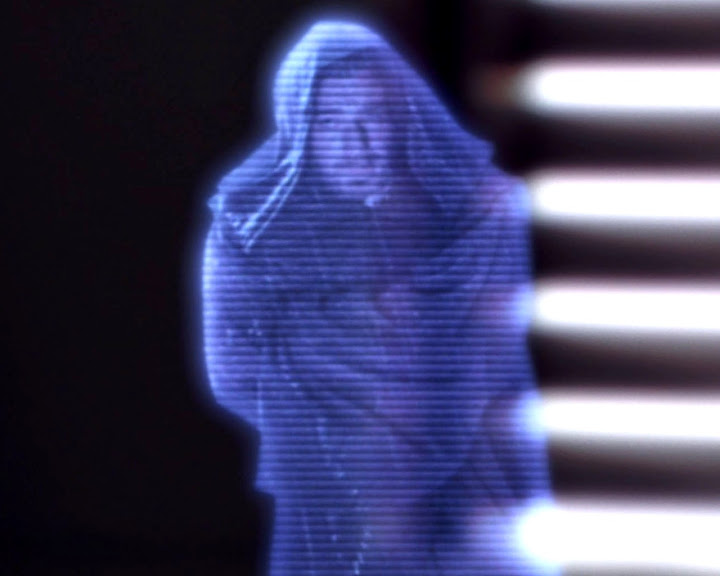
Figure I. This image is for educational purposes only used as reference for a digital art technique. Star Wars is a registered trademark of Disney.
What you believe to be the most simple part of this tutorial is actually fairly difficult. The color of the imagery will greatly impact the final result.
Let’s review the final technique as seen in Obi-1’s communication in Episode II from Kamino.
The color of Ewan McGregor and his wardrobe has not be replaced by black-and-white – as in our own image. There is a dullness to the color as if the transmitter was having a hard time sending color information across space. There are some “hot spots” where the brightest light converges. Last, there is a glow around the hologram.
We need to match this in own image. Turn on the “green” shape layer. This green began life as #21b67f but needs to take on a blue “color cast”. We need to change this layer around and add some details.
2. Make a new layer called “blue”. Turn off “green”.
3. On the “blue” layer add a medium blue of #7b9aaf in the selected area.
4. Copy the style from the MD font and paste them onto “blue”.
5. Change the Stroke settings in the Layer Options to a 6px, light blue of #75cac1 line. Make the options “Inside” with an opacity of 70%.
6. Change the options for Pattern Overlay to 22% in opacity and 79% in Scale.
7. Change the opacity for the “blue” layer to 87%.
8. Copy and paste these settings to the “gray” layer under the font layer “LOGIC”.
Now, we have a dull blue shape with a mostly transparent green-blue line around it and our gray vector box textured as well.
Next, we need to tone everything with the same medium blue color as we see in the reference shot.
2. Control click to select the square “fill” layer area in the “logo no fx” group.
3. Select the “blue cast” layer and fill it with #509ad0.
4. Use your eraser to remove the sharp edges and then fade the blobby shape around it’s perimeter.
5. Set the visibility of this layer to 58%.
Now we’ve taken the first major steps into finalizing this effect. Let’s move onto making some new layers to add color and a glow effect.
V. Color Refinement
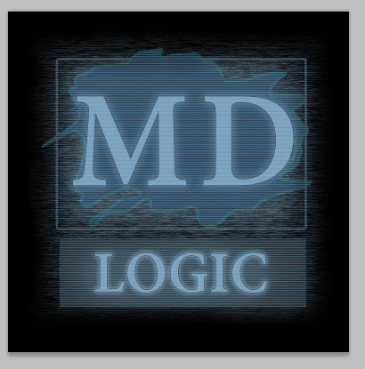
Figure J. Color applied to the “green” layer and name changed to “blue”. A new layer tones everything underneath of it to blue.
The rough effect is looking good. It’s time to look back to part IV and our list of notes for Obi-1’s Kamino message. We need white “hotspots” and we’ll also add some glow with a little variation for realism’s sake.
Hotspots? It is best to use custom painterly brushes to make these refinements. There are two places that I strongly recommend that you find them at. One, is at Vincent Montreuil’s dA site. The second is from big boss Kyle Webster who sells huge sets for extremely reasonable prices.
2. Using a grainy, spotty, textured brush, at about 30% opacity, select a very light blue.
3. Work out from the center of the word “LOGIC” reinforcing the brightness there.
4. Remember that you can use the eraser with a custom brush to re-work any overly bright areas.
5. Create a new layer named “texture for blue” over “blue” at 50% and repeat the same process.
Next, we want to add a few final highlights in the glow that will appear to be radiating from the “blue” layer inside of the artwork.
2. Airbrush in a bright, light blue color of #a2e9ec into the center of the artwork.
3. Make this a 50% Screen layer.
4. Under “blue color b” make another layer called “blue color c”.
5. Use the Airbrush to make a shape around the “blue layer” to accentuate the edges of this shape. This color painted on this layer should fit in between spaces of the previous “blue color b” layer and the “blue” shape layer.
That’s it for almost everything. We want to add another glow layer made out of blue and green to cascade around the image. Airbrush this in and set it outside and just below of the “logo fx” group.
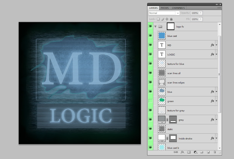
Figure K. The final art with all steps applied. Note the stacking order.
That’s everything for this one. The static layer can easily get toned down in your own work if you’d like to more closely match the even and non-distressed Star Wars hologram transmission style.
For those who want to more closely examine this file, or to proceed more quickly through this tutorial, I’m including the PSD file below. Please let me know by email if you have any questions, comments or find something missing (besides the $99 font Adobe Devanagari) from this demo.